Jan 8 2012 (a 6 minutes read)
Sketching intent paths
When we met in Denver for the ASIS&T 11th Information Architecture Summit in March 2011, me and Dan Willis tried to find five minutes to sit down and go through some of his notes for the whole run of the conference. Dan had read a late draft of Pervasive Information Architecture, and had some ideas to share in connection to diagramming.
For reasons it would be too complicated to explain here (but that included shepherding huge numbers of attendees in hotel showers, visiting speakeasies, having the most amazing conversations at 3am and then trying to stay awake during talks), we ended up taking a look at his drawings when the conference was closed, everyone was leaving, and tables and chairs were taken away as we spoke.
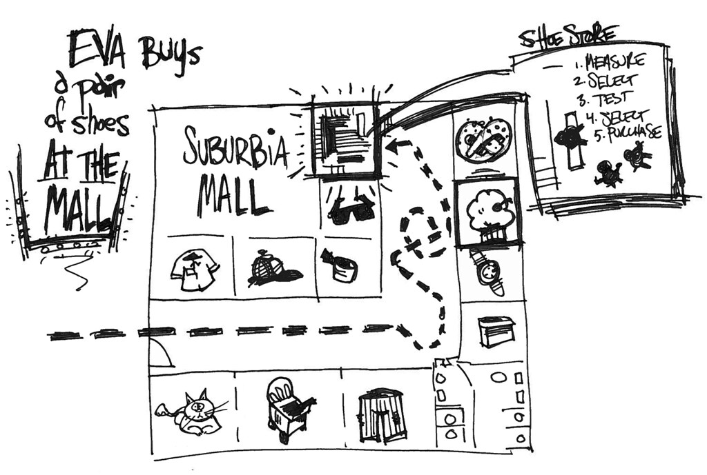
Dan kept working on his sketches, and released them on Flickr! as a set on Cross-channel diagramming in May 2011, with a shoutout to me and Dave Gray to go take a look. Dan started out by comparing the traditional, old school way to represent a use case via a list with using a map-like approach.
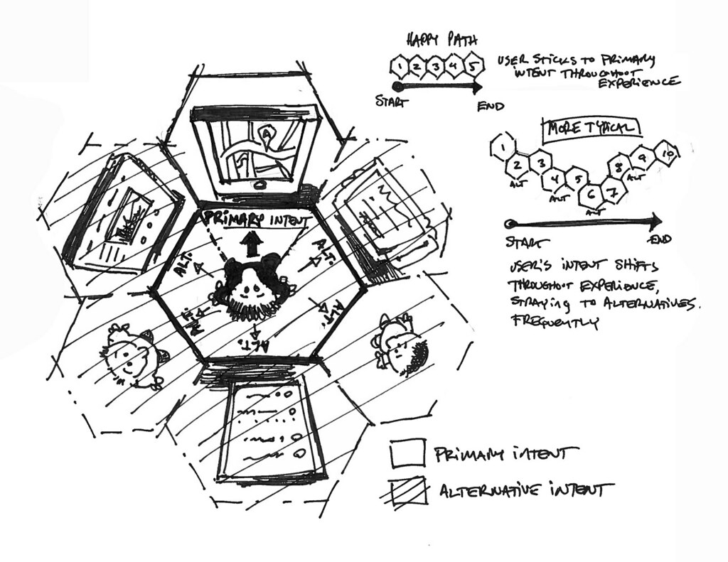
As Dan correctly points out, the most interesting element in the use of a map is that it allows the anchoring of certain tasks to specific places. In other words, the map allows for a greater deal of information to be easily and unambiguously contextualized. From there, Dan basically jumps into a honeycomb visualization that combines tasks and channels in what he calls intents.Intents come into two flavors: primary, always represented as being the forward choice for the user, and secondary or alternative, which complete the array of choices available. The primary intent represents the most prominent task / channel combination available, while secondary intents can be seen as the other choices. For the sake of a simple example, reading a sign in the street to orient oneself (primary) as opposed to stopping the car to ask a passer-by (secondary).
Dan observes that the fact that a user might strike a happy path which moves between primary intents only, maintaining absolute focus, is decidedly unlikely. Most of the times, users will wander through any number of primary and secondary intents (and across channels), as they adapt their seeking strategies to the situation at hand. I guess we could say that, from the user's point of view, a successful cross-channel experience is one which turns all wandering paths into happy paths. While this is momentous, I think that the break-through intuition here is that, in Dan's words,
at any moment during an experience, the user has a primary intent and a set of alternative intents.
What that means is that at any given step of a cross-channel experience, users face an array of graded choices, one of which, probably conforming to the principle of least effort, is the most visible / desirable and becomes primary. This resonates strongly with what me and Luca Rosati say when we introduce resilience in the PIA book, and even more with Marcia Bates' ideas on berrypicking as a strategy for information seeking [1]. The interesting bit: Dan takes this one step further, and explicitly introduces the idea that this path does not live inside one medium only.
In Dan's sketches, the honeycomb pattern couples each and every side of the hexagon with an intent, the touchpoint it relates to, and the channel this belongs to. The primary intent is visually represented as the one the user is facing: a more recent sketch also uses colors to highlight the difference between primary and alternative or secondary intents, and that definitely helps.
Unlike the CHUBE me and Luca describe in the PIA book (a design tool centered on the design process itself), these diagrams are supposed to illustrate parts or aspects of the user journey, what we call the actor's path through the ecosystem. Specifically, they are meant to illustrate the development of this path through time, choice after choice, and through a sequence of touchpoints that might or might not reside in the same channel. From my perspective, these choices are not all equally visible, important, or desirable. In late July I uploaded to Flickr a sketch that tried to address one of the points I found in need of further thinking.

Cool to see honeycombs redrawn by @resmini, but missing key pt: Primary intent=first person shooter - field of view matters most Also, percentages to what end? It's not that kind of a party. Let yer engineer's brain to step aside for the artist brain Personally, I think individual intent path is about what's possible; not about what's likely
I've been thinking about these comments, tried different approaches in my work for ISET, and shared the usual flow of notes and skype chats with Luca. I think I can make an argument for the necessity of visually representing the fact that not all channels are equal at any given step in the path. Note I'm not saying that I'm advocating circles instead of hexagons, or that we need percentages spelled out. Hexagons and no numbers work much better. What I'm saying is that we need to be able to visually assess the relevance of any channel at any moment in the path, as these are not the same and this has consequences on the design of the user experience.
Also, I think that one expression Dan uses in those tweets is potentially misleading: field of view is really not the way to go when describing how cross-channel options present themselves to the user. Many are not 'there', in our field of view, at all. You are trying to find a restaurant, walking or driving through a part of the city you don't know, and you reach for the smartphone sitting in your pocket to check the name of a street. How is this part of your field of view? In a way, we are talking about a cognitive map that we are trying to turn self-evident, visible, yes, but I wouldn't consider the process akin to that of physical vision.
Dan makes a good point there when he says that individual intent paths are about what is possible, not what is likely. But is that really what we try to capture when we diagram a cross-channel user journey? I advocate that knowing what is likely is also important: let me explain why.
I can think of two primary uses for intent paths diagramming: when analyzing an existing solution for improvements, looking for friction points or weak spots; when designing a new solution. In both cases, though, showing that choices are not all equal at a given step can provide important clues. Why is that touchpoint #a is more important, visible, or desirable than touhpoint #d? Is that the way we want it to be? Channels play a role in this as well.
In case #1, this would be precious intelligence for understanding why something does not work as expected. It could be that some secondary intent is really acting primary in the user mental model, and that is maybe an unwanted result, for any reason. I found myself in such a situation a couple of times while working on ISET, when trying to explain to stakeholders that one specific mobile app was in need of being redesigned to get way less prominent in situations where it acting like a tricorder might actually just overload or confuse the users.
In case #2, structuring channels and seams so that touchpoints reinforce each other, in context, has been so far for me the single most difficult part of a design to nail down. Managing the information flow, making touchpoints collaborate, preventing them to fight for the user's attention: this is hard. Visually representing their relevance provides one more tool for figuring out the puzzle.
[1] Bates, M. (1989). The Design of Browsing and Berrypicking Techniques for the Online Search Interface.


